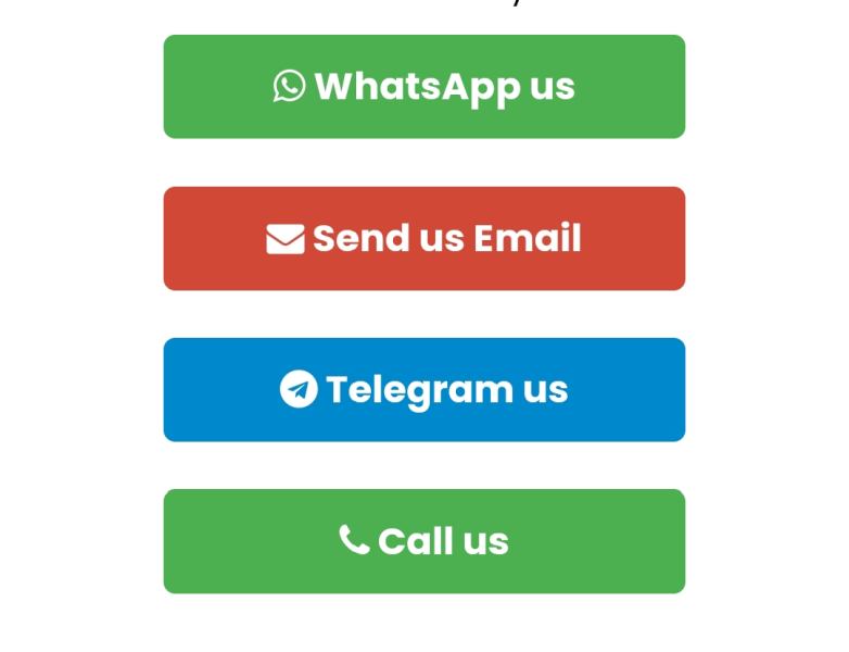
Flutter offers several ready-made buttons—ElevatedButton, TextButton, and OutlinedButton. Below is a quick guide to adding a button, styling it, and handling its onPressed callback.
1. Basic ElevatedButton
ElevatedButton(
  onPressed: () {
    // Action goes here
    print('Button tapped');
  },
  child: const Text('Click Me'),
)
2. Styling the Button
You can customize colors, shape, padding, and more with style. The most flexible way is ElevatedButton.styleFrom:
ElevatedButton(
  style: ElevatedButton.styleFrom(
    backgroundColor: Colors.blue,          // Button color
    foregroundColor: Colors.white,         // Text (and icon) color
    padding: const EdgeInsets.symmetric(
      horizontal: 24,
      vertical: 12,
    ),
    shape: RoundedRectangleBorder(
      borderRadius: BorderRadius.circular(8),
    ),
    elevation: 4,                          // Shadow depth
  ),
  onPressed: () {
    // Handle tap
  },
  child: const Text('Styled Button'),
)
3. Using TextButton and OutlinedButton
- TextButton—minimal, flat design:
TextButton(
  onPressed: () {},
  child: const Text('Flat Button'),
)- OutlinedButton—bordered style:
OutlinedButton(
  onPressed: () {},
  child: const Text('Outlined'),
)
4. Full Example in a Widget
import 'package:flutter/material.dart';

class DemoButtonPage extends StatelessWidget {
  const DemoButtonPage({super.key});

  @override
  Widget build(BuildContext context) {
    return Scaffold(
      appBar: AppBar(title: const Text('Button Demo')),
      body: Center(
        child: ElevatedButton(
          style: ElevatedButton.styleFrom(
            backgroundColor: Colors.green,
            foregroundColor: Colors.white,
            padding: const EdgeInsets.symmetric(horizontal: 32, vertical: 14),
            shape: RoundedRectangleBorder(
              borderRadius: BorderRadius.circular(12),
            ),
          ),
          onPressed: () {
            ScaffoldMessenger.of(context).showSnackBar(
              const SnackBar(content: Text('You pressed the button!')),
            );
          },
          child: const Text(
            'Press Me',
            style: TextStyle(fontSize: 16, fontWeight: FontWeight.bold),
          ),
        ),
      ),
    );
  }
}
That’s all you need to create, style, and handle taps on buttons in Flutter. Experiment with different styles and properties to match your app’s design.